Exploring the passions of ART & DESIGN created by me as as well as other inspiring 2 and 3 dimensional artists. Passions of American music from the 1920’s to the 1970’s focusing on blues, rhythm and blues, jazz, rockabilly, rock and roll, folk, etc.
Over the years, rebranding has been a necessity for me as I have had numerous entrepreneurial projects, some at the same time and others at different times. It has been crucial that each looks not only like what it is but that it is different from another project. Rebranding involves primarily two distinct elements, visual and verbal. In other words, a rebrand will include changes in words, the name of a company, its tagline and mission. Equally important is the visual change, a new logo, a different color scheme and typefaces. These ideally have the feel or spirit of what the company or project itself is about. The sampler of some of my business Google+ pages illustrate these points.
A Google+ Page Sampler
I have rebranded myself as many times as I have changed entrepreneurial projects. That includes more times than I can provide examples, here. Now, as an officially retired person, I still need a new brand. The reason for that is because I have reached the point where I am my brand. I have become something of a media personality. My ‘product’ is me. My brand is myself.
Examples of Rebranding: ALISON D. GILBERT
Facebook pages are a clear way to understand the differences in my brands. This Facebook page has a photo of me as the icon. It clearly shows whose page this is. My last project ART & BYTES has a very different brand, visually and verbally. Take a look at it below.
ART & BYTES Facebook Page
Examples of Rebranding: ART & BYTES
The above Facebook page has a totally different brand. It starts with the color scheme. Light blue rather than yellow is the primary color. The typeface is totally different. The icon is an ‘&’ playing on and emphasizing the name, ART & BYTES. The challenge of creating the ART & BYTES brand was that this project was a combination of all my previous work. It was designed as an archive of all my work in MARKETING BYTES and ALISON*S ART. This my goal was to create a brand that would combine both and yet maintain its own identity.
Examples of Rebranding: MARKETING BYTES
MARKETING BYTES came right before ART & BYTES. Below is a sample of one of its social media headers, the blog post header. Notice there is another icon, a different typeface and a different image of me. There is some similarity to the color scheme of ART & BYTES. But the two brands clearly are different.
MARKETING BYTES Blog Header
Examples of Rebranding: ALISON*S ART, INC.
The last example of one of my brands is from a project of Alison’s Art, Inc. It was Decorative Painting. Below is a facebook page from that enterprise. The icon is quite complex. It has unique colors, shapes, images, type and is totally distinguishable from all the others. In fact the oval pattern was the original Alison*s Art logo that became the foundation for all my art projects. Decorative Painting was one of those projects.
I would like to demonstrate the distinction between several of my brand by exhibiting both photo and logo icons. Clearly each is distinct. But at the same time there may be some similarity having been created by the same hand and a singular design sensibility, mine. At the same time, I think there is enough uniqueness to clearly demonstrates rebranding several of my projects.
ALISON D. GILBERT
The ART & BYTES Icon combining natural and digital design
At last year’s Jumpers and Jazz Festival–a music and textile art festival in Warwick, Australia–a team of 50 knitters built the Knitchen, a replica of a kitchen in which everything from the salt …Source:laughingsquid.com
Additional comments by Alison D. Gilbert, “This is the most original and creative project I have ever seen in my life. It just blows me away. I want to share it with everyone. At the start of this post I have substituted (the refrigerator photo) with a slideshow of some additional photos of the project, from the original source, ABC, Southern Queensland: Laughingsquid.com ABC Southern Queensland”
Hello Kitty and her new role: a farmer. But not just any kind of farmer, an organic farmer. Source: modernfarmer.com
Hello Kitty is one of the most popular brands for young people and the young at heart around the globe. It is a great way to introduce organic farming. Their motto and story title are, ‘Farm. Food. Hello Kitty. See on Scoop.itThe Food rEvolution
Hello Kitty Go Green Organic Farm’s features and activities
Here are some photos and text from the accompanying article, “Hello Kitty Hui organic carbon Farm Go Green Organic Farm. Into the pastoral experience green living organic carbon reduction. In recent years, green living tide sweeping the world, want to enjoy carbon reduction, they were green organic life are numerous. Your favorite green “organic Hui” has provided you with a good opportunity. Hui is an advocate of organic green, organic, carbon and grow organic crops based organization, with a total area of about 50,000 square feet. Aim through organic farming, training and related activities, so participants can experience communion and harmony of nature, relaxing life.”
Every once in a while a blog comes along that has such exquisite images that I have to pay homage to the whole thing. Casa Dulce Hogar has such a collection.
If you were browsing the internet at all this past weekend, there’s a good chance you came across Google’s ubiquitous logo at some point during your travels. What you didn’t notice, however, is the fact that the Google changed logo was done by adjusting the letters in its logo ever so slightly—and it actually makes a pretty huge difference.
AFTER
Alison D. Gilbert‘s insight:
I am not sure who it makes a big difference to. I could not even tell without being shown the before and after at almost the same time to see the movement.
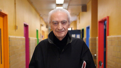
A self-styled “information architect,” Massimo Vignelli gave Modernist shape to book covers, shopping bags, furniture, corporate logos and, famously, a subway map.
Massimo Vignelli untangled the NYC subway with his famous 1972 map
Alison D. Gilbert‘s insight:
One of the greats of graphic design has left us. I will remember him for the NYC subway map which I treated like a collectors item when it was published.
See on Scoop.it – Avant-garde Art & Design
“The American Museum of Ceramic Art is honored to present ICHEON: Reviving the Korean Ceramics tradition, an unprecedented exhibition organized by Icheon, South Korea (and featuring Icheon Master Hand: Lee Hyuang Gu).
Icheon has a history of ceramic culture that began over 5000 years ago and has a reputation for its internationally renowned ceramics cultural events. Now Icheon has reached out to an American institution for the very first time. As the premiere exhibition of its kind in the United States, ICHEON will present over 230 objects never before seen on American soil that exemplify the revival of the ceramics tradition in Korea from antique techniques to contemporary innovations.
Icheon Public opening is from October 12th- December 29th. Join us in welcoming Icheon Dignitaries as we celebrate this major exhibition on Saturday, November 9, 2013, 6:00pm‐8:30pm.Founded in 2001 and opened in September, 2004, AMOCA is one of the few museums in the United States devoted exclusively to ceramic art and historic innovations in ceramic technology. It is located in an area abounding with ceramic history and internationally recognized clay artists from the Arts and Crafts Movement, the 60’s Clay Revolution and the current Studio Pottery Era.
Geographically, the building is located in an urban downtown district where art is an important element of the continuing and successful community revitalization program. The home community consists of a rich ethnic mix and a large academic constituency with approximately fifteen institutions of higher learning within an eight-mile radius. You can visit http://www.amoca.org for more information.” 10.23.13